
This part of the course is challenging as I do not see colour very well. My wife says I am colour blind! I have downloaded and also printed out the colour wheel to help me vision what needs to be done in this exercise. I have also downloaded and studied the Thoery of Colour handout from the OCA website. On the plus side I am currently in one of the most colourful capitals in Europe namely Palma, Mallorca during the period of this exercise.
The colour relationships is in two parts. I think the first part is the most difficult. We are asked to produce one photograpgh for each combination of primary and secondary colours. That is red/green, blue/organge, and yellow /purple. Not only to find these colour combinations together but to adjust the distance, focal length or framing so that the photographs are composed to the weight of the colour proportions described in the manual. That is, red and green in equal proportions, orange/blue in a ration of 1:2, and finally yellow/purple in a ratio of 1:3. The course manual advice is that "Finding these combinations will not necessarily be easy, and adjusting the proportions even less so."
My first red/green image I have selected is of a green plant against the background of a red door in the narrow streets of the old town in Palma. For all of this exercise I am using the Sony NEX6 with an f1.8 50mm lens (75mm equivalent). I am aiming to get the right framing and depth of field on these three photographs. Finding the right camera position seems to be crucial in order to isolate just the two chosen colours in these three sequences.
My next photograph is blue/orange where the blue has to be in a ratio of two to one to the orange. I found an orange coloured motorbike and framed it against a background of a nearby Spanish recycling bin and thise was blue. I have made the white lettering on the bin go out of focus by carefully selecting a wide aperture.
My final photograph was the most difficult to take. Finding yellow and purple together was challenging. I came across some Spanish signage in the street and two of the adjoining signs were of the required colours. The challenge was to frame them in such a way that yellow and purple were in the desired 1:3 proportions. The original street signage scene as I first saw it is illustrated below.


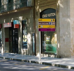
As mentioned, the third photograph above involving yellow and purple was the most difficult colour combination to find. I looked around and to the left is the original street scene where Imspotted the signage. This became the focus for this final photograph in the set of three above. I saw that there was purple and yellow adjacent to each other and the challenge became securing the right camera position and then capturing the image in a 1:3 ratio.
The second part of this Colour Relationships exercise is to produce three or four images which feature colour combinations that appeal. The combination can involve two colours or more.. The objective is to demonstrate that there is no single 'correctness' to complementray colours but that we should be aware of any imbalances and study the effect. When looking at balance, the manual says that the slight tension that comes from imbalance can be more interesting than perfect equilibrium. The advice is that we have to be aware of this and make use of it it our work.
The first photograph I have chosen is the roof of an old arcade in Palma. The light coming through the roof attracted my upward gaze. I framed it very carefull to try and make the photograph as symetrical as possible. I saw this as an example of two complementary colours with yellow being the prime colour and green being a derivative of yellow and blue.
The second photograph is of some coloured straws. We have three colours this time - a primary in the background which is blue, and two secondary colours namely orange and green. Orange and blue are complementary as they are opposites in the colour wheel and a primary and a secondary. Green and orange are both secondary colours and are a third of the colour wheel away from each other and so are contrasting secondary colours so perhaps some tension is introduced into the photograph.
The final photograph is of part of a shop front. The design of it stands out from other shops in the street. We are looking at red and blue. They are both primary colours and one third away from each other on the colour wheel and so they are two contrasting colours.
This has been an interesting exercise, especially with my difficulty with seeing colours correctly sometimes! I hope that I have got the correct interpretations in the descriptions above for the three images!


In this final exercise we are looking at converting colours into tones and black and white. The exercise is to photograph a still life comprising red, green, yellow and blue and to convert the colour image to black and white and use Photoshop image manipulation to adjust the image using the colour sliders. Elements does not have the converter called HSL/Greyscale for RAW files referred to in the exercise instructions so I am using a JPEG image and taking the route
'Enhance - Convert to black and white.'
My still life is of some children's lego pieces on a blue background. I set up the exposure using a Lastolite grey card to help get the right exposure. The colour image was captured and I undertook the conversion to black and white using the default setting of the sliders - red +60, green +28, blue +12 and contrast 0. To complete the exercise, I raised the red slider and experimented with lowering the brightness of the other sliders and then did the same with the green and blue sliders. Finally, I tried to get the best setting using all the sliders.
The aim of the exercise was to understand colour and how using the sliders in the conversion process enables you to emphasise certain objects in the scene while suppressing others. In black and white photography it is common for certain colours to look very similar when converted from colour. Red, orange, green, yellow and blue are the filters commonly used to help with this problem. Red filters have a strong effect and increase contrast and in landscape photography can turn a sky almost black. Yellow filters are very subtle and may be not be noticeable but may just lift a photograph a little. Green filters can be useful when photographing plants as they help separate green foliage from brightly coloured flowers and buds. Blue filters are rarely used as they darker most colours and reduce the contrast in an image.
I have not done much black and white conversion nor used black and white very much since shooting on FP4 black and white film in the sixties prior to colour. So this was a new experience for me to learn how to do this more effectively as, when I have done a few conversions in the past, I have just used the default. I shall be able to apply this new knowledge in the future - any perhaps do more black and white, especially as one of my key areas of interest is portraiture.
Lego pieces f4.5 @ 1/60 50mm iso800 (Click on each image to enlarge).
Original Default conversion Red filter + Green filter + Yellow filter+ Best using all sliders


