Assignment 3.
This Colour assignment is a challenge for me as I do not identify colours very well. I am taking my tutor's advice to slow down, make space for thinking and reflection and doing more reading and research. I have already downloaded and printed out the colour wheel to help me vision what needs to be done in the previous exercise and have carried this around with me. I have also downloaded and studied the Colour Theory & Relationships handout from the OCA website. I researched the theory of the colour wheel and found out that it came from a German writer, Johann Wolfgang von Goethe (1749 - 1832) who came up with the idea of arranging colours in the form of a colour wheel. His ideas were expounded in one of the many books he wrote. I have also found another useful OCA handout called Basic Colour Theory which mentions the work of Johanne Itten (1888 - 1967) who published The Art of Colour featuring his 'colour sphere' which included 12 colours. Itton developed Adolf Holzel's (1853 - 1934) colour wheel. Hozel was an artist painter whose style developed from Impressionist to expressive modernism. He had been interested in Goethe's Theory of Colour.
The OCA handout Basic Colour Theory, which mentions the work of Johannes Itton, expands on the OCA handout Colour Theory & Relationships by expanding categorisations. The first handout focuses on describing primary. secondary. complementary, contrasting, similar colours. accented colour and tones. The second one I have researched has more detail and explains how colour works on three levels - Visual (the immediate obvious level), Expressive (the emotional level evoking sensations that are often subjective and non-visual) and finally Symbolic (the cultural level where certain colours & combinations are associated with things we may have been brought up with). In addition to examining the qualities of colour - hue, brightness and saturation, and also primary and secondary colours, there is information on broken colours (mixture of hues that give an unsaturated effect), black & white, blended colours, multi-colour combinations, soft colours, colour contrast, the effect of distance on colours and finally coolness and warmth. A lot to take in!
The colour wheel and reading the two handouts and researching Goethe, Hozel and Itton has got me thinking about how I am going to approach this third assignment. For a more recent view of colour I have purchased and am referencing The Colour Photography Field Guide by Michael Freeman (who has written many books including the OCA recommended book, The Photographer's Eye).
The first fourteen years of my photography was pure black and white film (1954-1968) and I learnt to develop and print my images. Then I subsequently started using colour slide film and even had a go for a while at self-processing colour transparencies with a kit developed by the 3M company. Colour print has been my main vehicle since with a move to digital in 2006. So whilst looking forward to a colour assignment, I am very hesitant about how I am going to create interesting and creative work with this particular assignment!
The first fourteen years of my photography was pure black and white film (1954-1968) and I learnt to develop and print my images. Then I subsequently started using colour slide film and even had a go for a while at self-processing colour transparencies with a kit developed by the 3M company. Colour print has been my main vehicle since with a move to digital in 2006. So whilst looking forward to a colour assignment, I am very hesitant about how I am going to create interesting and creative work with this particular assignment!
In this assignment we are asked to show a command of colour in photography, being able to find and use different colours in deliberate relationships. We are looking at four kinds of colour relationship in the assignment -
• Complementary (colours that face each other across the circle)
• Similar (those near each other, as in a cool or warm range of colours)
• Colours spaced about a third of the way around the circle: very different from each other,
but not quite complementary.
• Accent where one small area of colour sits against a much larger background of another colour as a spot or accent.
We are asked to take about four photographs each (16 altogether) that illustrate the following colour
relationships as follows -
• colour harmony through complementary colours
• colour harmony through similar colours
• colour contrast through contrasting colours
• colour accent using any of the colours.
We are asked to indentify at least two kinds of colour relationship in each group.
The aim will also be to try and compose the images to the weight of the colour proportions described in the manual. That is, red and green in equal proportions, orange/blue in a ration of 1:2, and finally yellow/purple in a ratio of 1:3. (This theory of colour proportions assumes that the colours are pure and exact but Michael Freeman says that this rarely happens. So the theory is a guide and we have to take into account the actual characteristics of the colours).
We are asked to vary the subject matter, including both arrangements (such as a still-life) and found
situations.
In arranged photographs, we have the advantage of being able to choose objects and settings that have the exact colours we are looking for. In uncontrolled situations more careful observation is required.
To accompany our photographs we are asked to make notes about the ways in which the colour works in each image and to make a sketch for each to show the balance and movement.

I have difficulty in remembering the wide range of colour combinations we are being asked to record in the four groupings - harmony through complementary, harmony through similar, contrasting colours and colour accent - so I am using colour pens and making notes in my sketchbook which I carry around with me. There is also an argument that says that we should not try to be too scientific in application but use intuition also.
So far I have considered three different approaches. An assignment featuring a random collection of images, but I am trying to get a series of consistent images and a theme as my tutor suggests. I have also considered doing a series involving people portraits where they wear (or choose) items representing two colours but this could focus more on the character of their faces rather than the colours. One attraction of this approach was that it would be possible to statistically analyse what colour combinations a random selection of people choose from the various combinations of the primary and secondary colours. I have looked at over a dozen assignments done by other students and many involve random images. The excellent video on WeAreOCA, entitled Plan+Research+Reshoot mentions the advantage of choosing a subject where you can review and revisit your images.
So far I have considered three different approaches. An assignment featuring a random collection of images, but I am trying to get a series of consistent images and a theme as my tutor suggests. I have also considered doing a series involving people portraits where they wear (or choose) items representing two colours but this could focus more on the character of their faces rather than the colours. One attraction of this approach was that it would be possible to statistically analyse what colour combinations a random selection of people choose from the various combinations of the primary and secondary colours. I have looked at over a dozen assignments done by other students and many involve random images. The excellent video on WeAreOCA, entitled Plan+Research+Reshoot mentions the advantage of choosing a subject where you can review and revisit your images.
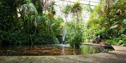
I continued to explore options including thinking about a jungle shoot. No jungles locally! But I spent time in a large tropical greenhouse studying the exotic colours and cataloging various colour pairs on my iPhone. Eventually, this is selected as the basis for my assignment and it will have a clear theme as my tutor has suggested - colour shoot in a tropical greenhouse.
It's very hot! My glasses steam up when I go to the upper reaches so what about lenses? Water droplets fall from the large leaves above. I decide to use my Nikon D7100 with one lens - not my favourite one but it offers the prospect of one lens for everything without having to change lenses in this hot and damp environment. I am using the Sigma 18 - 200mm F3.5 - F6.3 coupled with a remote release and a Velbon tripod over four visits to this location.
It's very hot! My glasses steam up when I go to the upper reaches so what about lenses? Water droplets fall from the large leaves above. I decide to use my Nikon D7100 with one lens - not my favourite one but it offers the prospect of one lens for everything without having to change lenses in this hot and damp environment. I am using the Sigma 18 - 200mm F3.5 - F6.3 coupled with a remote release and a Velbon tripod over four visits to this location.
Tropical Shoot - Roath Park Tropical Conservatory.
Colour Harmony through Complementary Colours
This first section features examples of all three combinations of the primary complementary colours - red/green, orange/blue and yellow/purple. I am using Photoshop Elements 11 selecting
Filters - Artistic - Palette Knife, with a Wacom sketch tablet to examine balance, movement and the way in which the colours work
Photo 1.
The first photograph is a Neoregelia. I was attracted on how the leaves radiate out with the red colour transitioning to green. Hence we have nature combining the two primary colours in one plant. Red and Green have equal space in the photograph and similar weight in terms of their colour strength. This is the most common colour combination in nature. I am very pleased with this first image I have selected. Goethe gave the three primary and three secondary colours the following numbered weighting classification as follows:-
Yellow 9
Orange 8
Red & Green 6
Blue 4
Purple 3
So in this instance, we are working on a ratio of 1:1
Neoregelia (Blushing Bromilliad), a native of the South America rainforests
f5.6 @ 1/10 iso400 120mm lens setting
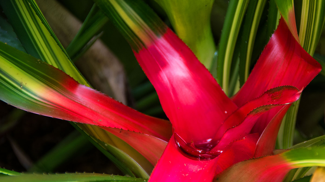
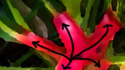
Photo 2
The second photograph illustrating complementary colours that face each other across the colour circle is also a red green composition and the plant is Ruellia Amoena [Graecizans] with the popular name of Red Christmas Pride and originating from Brazil. I see a T formation in this image, or maybe an L image. The line of the leaf leads us into the top of the left flower and the bottom of the right hand flower. The reds do not appear to be in unison and command more attention to my eyes than the green leaves hence I have given a larger area of green. The colours maybe complementary but I see both flowers in competition with each other.
Ruellia Amoena [Graecizans] Red Christmas Pride
f6.3 @ 1/90 iso400 200mm lens
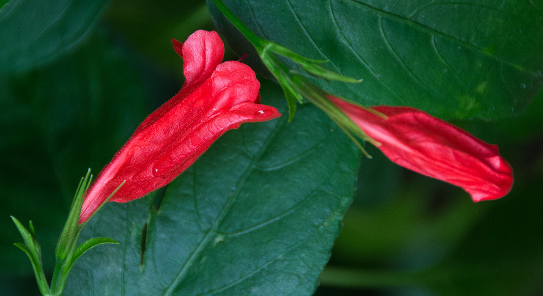

Photo 3
The third image in this first set of four photographs illustrating colour harmony is a still-life. The brief says we are to 'vary the subject matter to include both arrangements (such as still-lie) and found situations.' It was not possible to bring cuttings of any of these plants from the tropical conservatory to a still life set at home. So it was necessary to take the still life backgrounds to the conservatory. Here we are photographing a Helicona Angusta, commonly known as a lobster's claw, against a purple art paper mounted on a 50mm x 40mm mount. Flash has been used to lighted the set and with yellow being the strongest of all the primary and secondary colours in the colour wheel, we are using a ratio of yellow:purple as 1:3. So this is the colour combination that gives intense results and the rarity of purple makes it an uncommon relationship. The plant is positioned so that the green leaf creates a strong diagonal and our eyes concentrate on the candlestick shape of the yellow areas. I would have liked to have been able to position the purple background further back but the undergrowth is so dense, it is almost impossible to insert any sort of backdrop anywhere. The plant is native to south eastern Brazil, and classified as vulnerable by the World Conservation Union.
Helicona Angusta commonly known as a lobster's claw
f4 @ 1/125 iso200 29mm lens flash
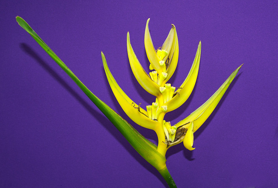

Photo 4
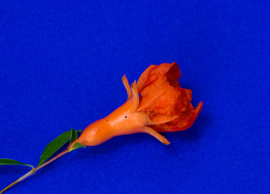
Finally, in this first set of four photographs illustrating colour harmony through complementary colours we are showing the flower of a Punica Granatum, known as Pomegranate, photographed against a blue background. The foliage in the tropical conservatory is very dense so once again we have to be careful to isolate overlapping plants whilst at the same time not damaging any of them. The Punica is a fruit-bearing deciduous shrub and Pomegranates are used in cooking, baking, juices, smoothies and alcoholic beverages, such as martinis and wine. It is believed to have originated in Iran. Orange is the next most strongest colour after yellow and blue is similar to purple and much less strong. So we have arranged a large blue background. The flower has been arranged diagonally from left to right in the way that we read things and the smallness of the orange to the large blue background seems to be balanced. Orange and blue were the most difficult colours to find in the tropical conservatory. Some of the diagramatic colour combinations in Michael Freeman's Colour Photography Field Guide book have been very useful in helping me visualise how this photographs might be created. Michael says. "Of the three classic colour harmonies, orange/blue is probably the most easiest to find photographically, becasue both colours are close to the colour temperature scale of light."
Punica Granatum, known as Pomegranate
f6.3 @ 1/145 iso200 200mm lens

Colour Harmony through Similar Colours
The next set of images are to depict colour harmony through similar colours. These are colours that are near to each other on the colour wheel.
Photo 5
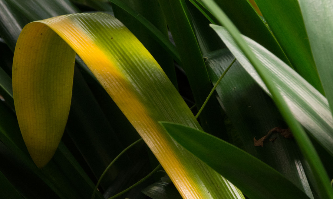
The first image is the edge of a leaf from a banana plant. I was attracted by the texture created by the lines in the leaf which are diagonal. Green blends into yellow which being the brightest colour in the colour wheel is a small part of the image. The brown edge of the leaf creates a sharp line between the leaf and the background. The background is the natural habitat and not a green card. I feel movement in this photograph rather like waves flowing onto a sandy beach or rain pouring down. My eye runs backwards and forwards along the brown edge of the leaf. This simple composition is one of my favourites in the whole set.
Musa - banana plant
f16 @ 1/124 iso800 200mm lens
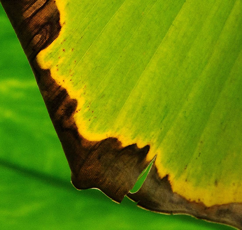

Photo 6
The second photograph in this set of four is Clivia, a native of South Africa and is yellow and orange and has a natural warm feel. Orange and yellow are next to each other on the colour wheel and also similar in strength with yellow being that just bit stronger, hence it is slightly smaller in the flower in nature's true way. I feel the leaves radiating out from the centre whilst at the same time feeling a sense of circular motion - like a propeller on an aeroplane.
Clivia, known as Kaffir lilly.
f5.6 @ 1/500 iso400 86mm lens
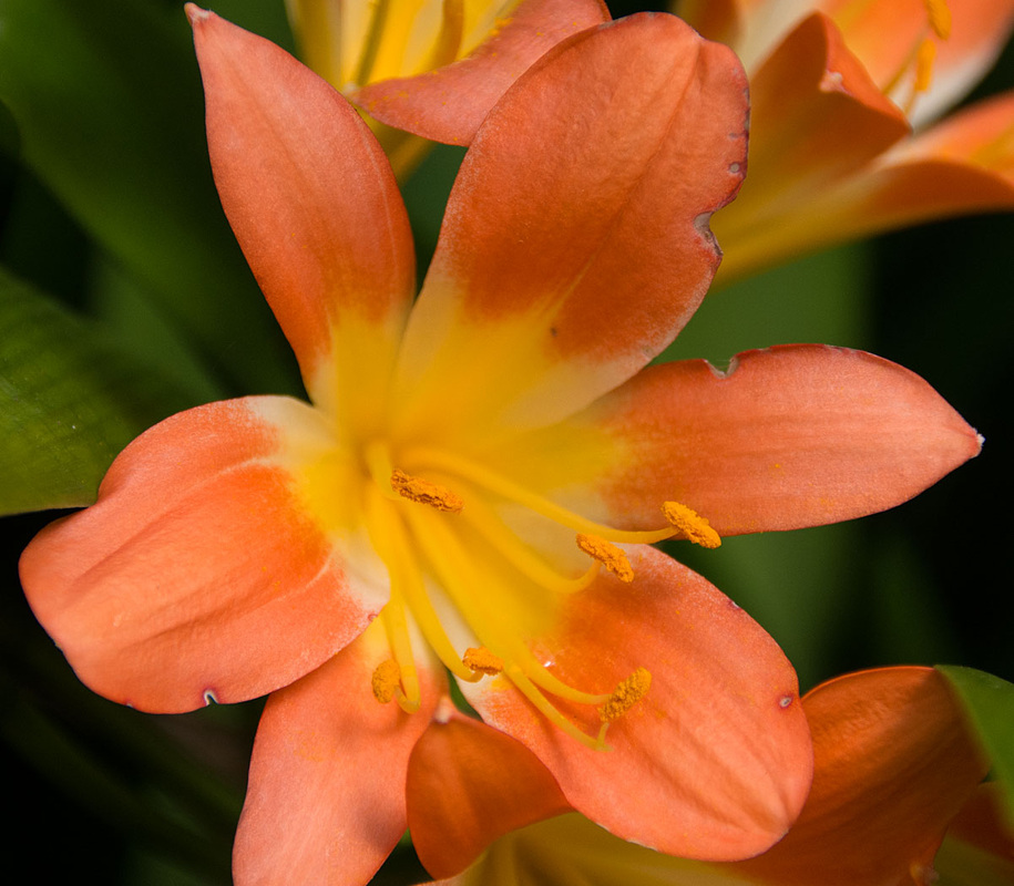

Photo 7
The third photograph in this second set of colour harmony through similar colours is from the Hibiscus family and is native to East Asia and features yellow and orange again. This time yellow dominates more space in the frame and is also the strongest colour. But because the orange part has five larger structures compared with the multiplicity of the yellow parts of the stem, intuitively I am happy with that. I have positioned it diagonally and my first impression is that this is like a rocket going into space with a landing module on the front and power cells on the sides being jettisoned as the fuel burns off. The background is natural and I have darkened it slightly in photoshop to reduce the green.
Rosa-Sinensis, part of the Hibiscus family
f5.6 @ 1/90 iso200 120mm lens
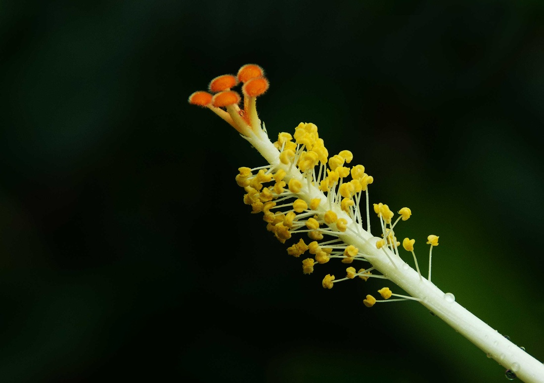

Photo 8
The fourth and final photograph in this second set is another yellow and green image and is a leaf from the same family as the orange and yellow flower in this set - Clivia known as Kaffir lilly. The yellow strip is compaired with the three green areas of the photograph in my sketch below and I have illustrated the balance. I like the way in which the yellow leads us diagonally into the curve downwards to darkness where you half expect a small jungle animal to suddenly appear out of the darkness. I have used a high iso and a small aperture to keep some detail in the depth of the photograph but at 120mm lens, this is going to be limited of course. I feel the photograph is very balance and because the jungle is a very green lush environment it is relatively easy to get the right balance when you find the right yellow.
Clivia leaf
f16 @ 1/30 iso800 120mm lens

Colour Contrast through Contrasting Colours
For this third set of images we are asked to produce photographs that show contrasting colours. There are colours that are spaced about a third of the way from each other around the colour wheel. In my sketchbook, of which there is an illustration in the early part of this assignment, I have used coloured pens to illustrate the different combinations in these four categories and their approximate strength by the thickness of the colour in my sketch. For this part of the assignment I have identified six possible colour combinations and I found five of the six combinations here in my jungle environment. My selection of four follows.
There are not many purple colours to be found here and they are often on the underside of leaves. One of the photgraphs I had origally selected for this section was such a purple and balanced with green but I subsequently removed it from my selection. So I am showing yellow and blue, orange and green, red and blue and purple and green.
Photo 9
My first photograph in this set is a Pachy Stachys commonly known as a lollypop plant. These plants are native to the Carribean and also Central & South America. I do not visualise lollies in this photograph but six canaries coming out of a nest. The abstraction that the sketches give in terms of visualising fantasies is amazing. I feel a triangular shape here and the powerful colour of the yellow is balanced by the more subdued blue although this blue is a little brighter so I am looking for a ratio yellow/blue of around 3:8. This is another photograph where we are using a coloured card background to isolate the plant from the intense jungle green background. I am using a cable release to fire the camera combined with a 10 second time so that I can get the card in the right position. There is a lot of trial and error sometimes and where the shutter speed is slow, care has to be taken not to be moving the subject. This is partcularly true here where we are on f16 for sharpness throughout the six flowers at 140mm lens setting relatively close with the slow slow speed of 1/10th sec. It is still in the tropical conservatory and there is no wind to worry about with these photographs but it is hot hot and damp.
Pachy Stachys commonly known as a lollypop plant

Photo 10
Orange and green are the colours in my second photograph in this contrast set. I have chosen Brugmansia commonly known as angel's trumpet. They are native to tropical regions of South America, along the Andes from Venezuela to northern Chile, and also in south-eastern Brazil. In the mass of foliage criss-crossing our jungle environment I have managed to isolate this cluster with a fairly neutral green backdrop of colour comprising leaves and ferns. The flowers remind me not of angels trumpets, although it would be wonderful to see some angels in the jungle, but of church bells. There is a vertical movement that I see in this image but also my eye is taken backwards and forwards across the bottom of the image in a swinging movement and I have annotated this below in the sketch.
Brugmansia commonly known as angel's trumpet
f16 @ 1/60 iso800 120mm
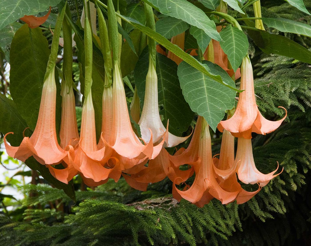

Photo 11
Next we are looking at a red and blue combination. This is Hibiscus Schizopetalus and is native to tropical eastern Africa in Kenya, Tanzania and Mozambique. The environment is so dense here that when we look upwards we do not see a blue sky, only green foliage. So in this photograph I have used some textured coloured felt to give a blue background. It's floppy felt so I really needed an extra pair of hands but no such pair nearby. I love the sketch below. It reminds me of an alien space ship hovering and detaching two landing modules so that the occupants can come and find out who we are. Blue and red are similar normally in strength with blue being slightly weaker, (and it is a light blue in this instance), so I have given blue a greater area in this photograph and feel it is balanced.
Hibiscus Schizopetalus
f11 @ 1/500 iso800 55mm lens
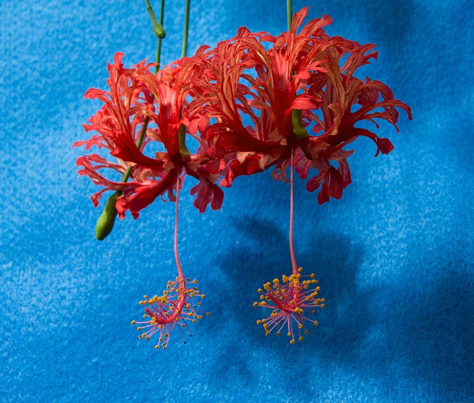

Photo 12
Finally, in this contrast set we are looking at a green and purple contrast combination. As I said previously, purple is a rare colour here and I have found this Tradescantia Zebrina commonly known as wandering jew. It is native to the Gulf Coast region of eastern Mexico. I have captured the purple leaves of this plant against a bright green natural background. Purple is the weakest of the colour circle in terms of colour strength and green is more towards the middle. So in theory, the purple area should be bigger and more dominant. However, the green is light and moving towards yellow, the strongest colour, and so intuitively I feel that I have got the balance right. I sense a zig zag upwards and downwards movement in this image. Maybe this is the path up to heaven (or downwards to hell)?
Tradescantia Zebrina commonly known as wandering jew
f6.3 @ 1/60 Iso200 200mm

Colour Accent
Finally the last set of images in this assignment - Colour accent. I thought this would be the easiest part of the colour assignment to complete and that looking for a small outstanding colour would be easy. But in the jungle environment everything appears like a blanket of green - and not even a parrot in site. We are looking for a small area of colour against a much larger background of another colour as a spot or accent. There are four different spots used - red, purple, blue and yellow in this final sequence.
Photo 13
First red. This is a Clivia seed pod. It reminds me not of a seed pod but of some sort of computer generated insect. I have placed it in the bottom left hand corner of the photograph and the leaves point upwards and lead my eye up and down the image as though the insect is going to launch skyward. The red pod is sharp and the leaves gradually go out of focus ensuring the eye always leads back to the pod. This is another favourate image, although I don't know why. Perhaps this is another example of emotional interpretation rather than just visual. There is no symbolic interpretation here however.
Clivia Seed Pod
f6.7 @ 1/80 iso 400 46mm lens
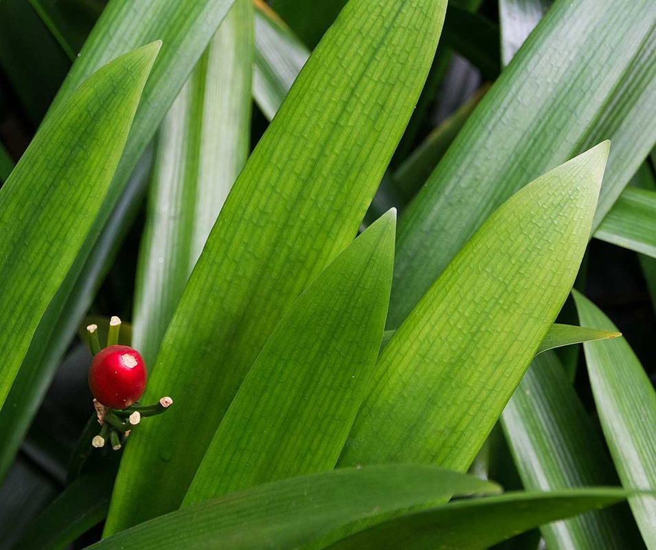

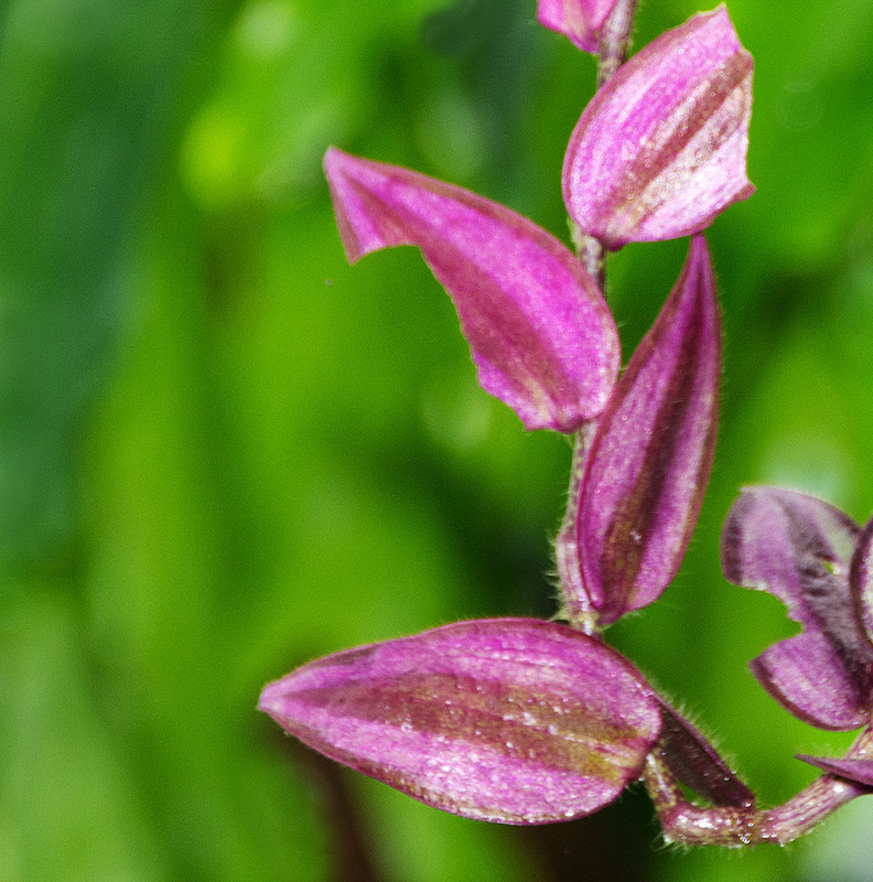
Photo 14
Next we are looking at purple. This is the small flower of the Petreavolubillis which has fallen on to a large leaf.
Whilst purple is the least strongest of colours and green is somewhere in the middle, the purple really catches the attention in this photograph and I have used optical blur to make it more prominent. The depth of field is extremely narrow with even the front of the leaf being out of focus. There is a diagonal feel to this photo and when the tropical rains or winds come along, I would expect this tiny flower to be washed off its current resting position on the green leaf.
Petreavolubillis
f2.8 @ 1/100th iso800 50mm 1.8 prime lens - this was one of two images taken on the Sony NEX6
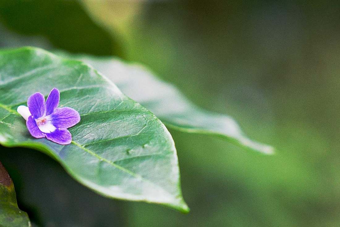

Photo 15
Next we are looking at a blue accent. There are few blues here in the jungle environment and this was the most challenging. I found a Ipomoea but it was surrounded by other colours so I had to settle for a closer crop that I would have liked. I have positioned the flower just left of centre. I feel as though we are going to enter the centre and we are going to travel through a tunnel to another world beyond. So, there is an emotional element to this photograph for me, as well as a visual one. This image and the second one in this series are the ones I least like. I considered going outside the tropical greenhouse to get this shot into the wonderful colourful gardens beyond but I felt that that would break the consistency of the shoot that my tutor suggested.
Ipomoea
f2.8 @ 1/100th iso800 50mm 1.8 prime lens - this was the second of two imges taken on the Sony NEX6
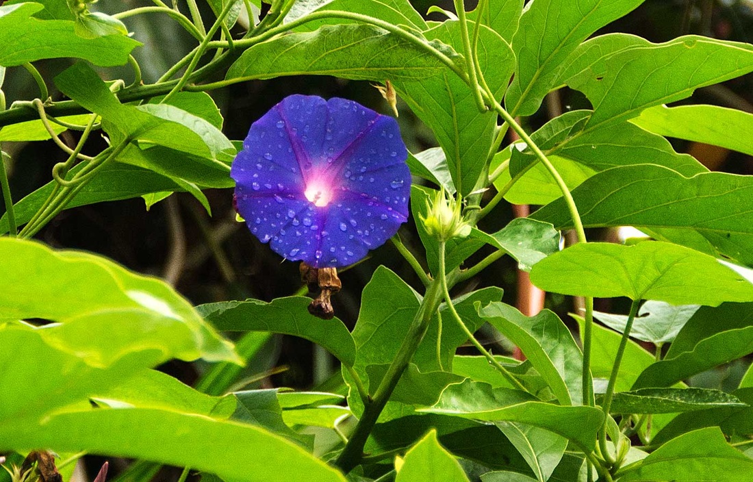

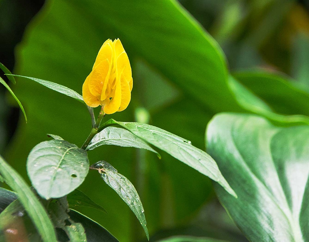
Photo 16
The final photograph is the colour accent set, and the final photograph of the 16 is this series is the Pachystachys commonly known as the lollypop plant. This is the same plant as we used in photograph number nine but here we have one flower in isolation. The yellow is the strongest colour in the colour circle and I have photographed the flower against its natural green environment using differential focussing again to give us the optical blur for the flower to stand out even more as an example of colour accent. The sketch illustrates how the bright downward light is highlighting the front leaves.
Pachystachys, commonly known as the lollypop plant
f11 @ 1/125 iso800 100mm lens


Assessment Criteria Points
First before making comments on this assignment, I would like to thank the staff of the Roath Park Tropical Conservatory for their help on my visits and explaining some of the plants, not least in helping me spell and understand the latin names of these exotic plants. Also their relaxed and friendly nature - no Jobsworth here such as, "Sorry Sir, you can't use that tripod there - someone might fall in the pond". Also we made other friends such as the terrapins and the white faced South African whistling ducks, known as Jack and Vera.
First before making comments on this assignment, I would like to thank the staff of the Roath Park Tropical Conservatory for their help on my visits and explaining some of the plants, not least in helping me spell and understand the latin names of these exotic plants. Also their relaxed and friendly nature - no Jobsworth here such as, "Sorry Sir, you can't use that tripod there - someone might fall in the pond". Also we made other friends such as the terrapins and the white faced South African whistling ducks, known as Jack and Vera.
Demonstration of Technical and Visual Skills
As I explained at the beginning of this assignment, I do not have a good sense of colour and sometimes get colours confused, but I am not colour blind and can ask someone if I am not sure if I am seeing blue or purple for example.
I was pleased with the materials I selected, ranging from deciding to use my Nikon gear for virtually all of the shots, the decision to use a tripod (albiet in a confined jungle type public space) through to the coloured card and the coloured felt I purchased to meet the requirement for different arrangements such as still life. I had a slight concern that the Sigma 18-200mm lens might have been a little soft on the upper reaches on some of the shots. I took just over three hundred photographs during my four visits to the conservatory from which I selected the 16 images. I took many more potential colour assignment photographs whilst I was in Spain when I was considering earlier themes, but these were not used of course.
Regarding technique, I am pleased that I took my time on this assignment and was even able to sit down and review and consider my approach whilst I was in the conservatory from time to time. The sound of the water fall, the fish swimming, the South African tree ducks whistling helped my creativity in these relaxing moments. I made various exposures of each set up but mainly used Aperture priority being mindful of the need to manage depth of field in what was often confined spaces and also Programme mode as an alternative. I relied on judgement and the camera's internal light meter and not the Sekonic as I was trying to 'travel light' in the hot damp conditions in the conservatory. In the poor light in some of the areas of the conservatory, some of my images were flat and I was able to use my Raw images to make improvements and corrections.
In terms of observational skills and visual awareness this was a difficult challenge as the inside of the conservatory was a mass of exotic tightly packed plants with little room for manovere, so it was necessary to stand back and let the eyes wander and pick out the subjects in the mass of green. At one point I was considering widening the shoot to encompass the whole of the wonderful Roath Park Gardens but decided to keep the project focussed on this theme. Referring to the colour wheel and the special coloured diagrams showing colour groupings and weighting in my sketch book I was carrying was helpful. Also in researching the project I was greatly helped with Michael Freedman's book The Field Guide to Colour Photography which I had found out about whilst researching colour.
With regard to design and compositional skills, I wanted to have a consistent approach as my tutor had advised in my last feedback. Technically, I shot everything in landscape format and I wanted a set of images that would display side by side in a consistent way, despite the wide range of colour challenges I was addressing. My main concern was how to blend the 'still-life' approach using the felt and the card with the natural situations I found. Photographs 3, 4. 9 and 11 come into the arranged 'still-life category. Photos 3 and 4 are the ones which I feel blend in least. I did these four images in this way for two reasons. Firstly to try and meet the terms of the brief and secondly because of difficulties finding the right colour match in a sea of green. If I was preparing a panel of images to display, I would have to consider whether I left some or all of these images out. I am happy with the way I have composed most of the images reflecting on some of the things learnt in previous exercises such as the strength of diagonals. I have never done colour sketch analysis before and learning to use the Palette Knife and annotate images in Elememts 11 was a new learning experience.
Quality of Outcome
Generally I am very pleased with the quality of outcome on this assignment, having spent more time planning, researching and thinking. But the end product must be for others to decide. I particularly enjoyed focussing on a very specific area of plants - an area about which I knew nothing except bananas. I have never explored colour concepts before and can't even remember if the colour circle ideas were covered when I did Art 'O' Level many years ago. So the OCA handouts, the research of Goethe, Itten and Hozel, together with Michael Freeman have been a most useful contribution to my learning experience and my pursuit of quality in these images. On a practical level I tried to present the images with both technical camera data and data about the subject. So I feel that a sequence of these images could tell a short story of exotic plants. It is the beauty of nature in simple plants that I would be seeking to convey in the images, some of which are simple plant photos and some have an almost abstract quality that for some people might produce an emotional process and well as a viewing experience. The use of the sketched versions using Palette Knife might make an abstract display where the viewer would have to be thinking more about what they were seeing.
Demonstration of Creativity
I don't think this assignment has produced great creativity in my approach. The brief gave very specific colour combination requirements and within a specific location my priority was to understand and learn about colour more. However, I did find myself looking for creative approaches rather than just taking photographs of ordinary colour combinations. For example, the banana leaf (photo 5) is a photo I would not normally thought of taking so may be my eyes are opening and I am 'thinking outside the box' as my tutor suggests. My personal style has always been to try and combine strategic thinking with operational application and I hope that the way in which I have approached this assignment has worked - 'big picture' and widening ideas, honing in on one or two options, selecting an option and seeing it through, and finally presenting consistency with detailed data.
Context
Within the Art of Photography course so far, this has been the most challenging and the one I have taken most time over, thinking, planning and shooting both here at home and when I was in Spain last month. I am starting to use research more and study other peoples ideas - OCA materials, WeAre OCA video, other student logs and other sources such as websites, The Journal of British Photography and Martin Field's useful colour book. Hopefully I can put further ideas and learning into the next assignment which is Light which I shall be working on whilst I am in Devon and then in France during this month.
A Final Reflection?
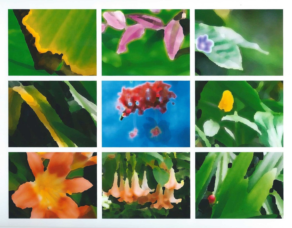
Impressed with the Photoshop Palette Knife I have discovered, to use and annotate for the sketches, I wondered how some of the plants would look as a panel. I guess the sort of subject you choose for this type of manipulation is important but I think it works well with these tropical plants. I think I might mount this and give it to the Roath Park Conservatory.
As I explained at the beginning of this assignment, I do not have a good sense of colour and sometimes get colours confused, but I am not colour blind and can ask someone if I am not sure if I am seeing blue or purple for example.
I was pleased with the materials I selected, ranging from deciding to use my Nikon gear for virtually all of the shots, the decision to use a tripod (albiet in a confined jungle type public space) through to the coloured card and the coloured felt I purchased to meet the requirement for different arrangements such as still life. I had a slight concern that the Sigma 18-200mm lens might have been a little soft on the upper reaches on some of the shots. I took just over three hundred photographs during my four visits to the conservatory from which I selected the 16 images. I took many more potential colour assignment photographs whilst I was in Spain when I was considering earlier themes, but these were not used of course.
Regarding technique, I am pleased that I took my time on this assignment and was even able to sit down and review and consider my approach whilst I was in the conservatory from time to time. The sound of the water fall, the fish swimming, the South African tree ducks whistling helped my creativity in these relaxing moments. I made various exposures of each set up but mainly used Aperture priority being mindful of the need to manage depth of field in what was often confined spaces and also Programme mode as an alternative. I relied on judgement and the camera's internal light meter and not the Sekonic as I was trying to 'travel light' in the hot damp conditions in the conservatory. In the poor light in some of the areas of the conservatory, some of my images were flat and I was able to use my Raw images to make improvements and corrections.
In terms of observational skills and visual awareness this was a difficult challenge as the inside of the conservatory was a mass of exotic tightly packed plants with little room for manovere, so it was necessary to stand back and let the eyes wander and pick out the subjects in the mass of green. At one point I was considering widening the shoot to encompass the whole of the wonderful Roath Park Gardens but decided to keep the project focussed on this theme. Referring to the colour wheel and the special coloured diagrams showing colour groupings and weighting in my sketch book I was carrying was helpful. Also in researching the project I was greatly helped with Michael Freedman's book The Field Guide to Colour Photography which I had found out about whilst researching colour.
With regard to design and compositional skills, I wanted to have a consistent approach as my tutor had advised in my last feedback. Technically, I shot everything in landscape format and I wanted a set of images that would display side by side in a consistent way, despite the wide range of colour challenges I was addressing. My main concern was how to blend the 'still-life' approach using the felt and the card with the natural situations I found. Photographs 3, 4. 9 and 11 come into the arranged 'still-life category. Photos 3 and 4 are the ones which I feel blend in least. I did these four images in this way for two reasons. Firstly to try and meet the terms of the brief and secondly because of difficulties finding the right colour match in a sea of green. If I was preparing a panel of images to display, I would have to consider whether I left some or all of these images out. I am happy with the way I have composed most of the images reflecting on some of the things learnt in previous exercises such as the strength of diagonals. I have never done colour sketch analysis before and learning to use the Palette Knife and annotate images in Elememts 11 was a new learning experience.
Quality of Outcome
Generally I am very pleased with the quality of outcome on this assignment, having spent more time planning, researching and thinking. But the end product must be for others to decide. I particularly enjoyed focussing on a very specific area of plants - an area about which I knew nothing except bananas. I have never explored colour concepts before and can't even remember if the colour circle ideas were covered when I did Art 'O' Level many years ago. So the OCA handouts, the research of Goethe, Itten and Hozel, together with Michael Freeman have been a most useful contribution to my learning experience and my pursuit of quality in these images. On a practical level I tried to present the images with both technical camera data and data about the subject. So I feel that a sequence of these images could tell a short story of exotic plants. It is the beauty of nature in simple plants that I would be seeking to convey in the images, some of which are simple plant photos and some have an almost abstract quality that for some people might produce an emotional process and well as a viewing experience. The use of the sketched versions using Palette Knife might make an abstract display where the viewer would have to be thinking more about what they were seeing.
Demonstration of Creativity
I don't think this assignment has produced great creativity in my approach. The brief gave very specific colour combination requirements and within a specific location my priority was to understand and learn about colour more. However, I did find myself looking for creative approaches rather than just taking photographs of ordinary colour combinations. For example, the banana leaf (photo 5) is a photo I would not normally thought of taking so may be my eyes are opening and I am 'thinking outside the box' as my tutor suggests. My personal style has always been to try and combine strategic thinking with operational application and I hope that the way in which I have approached this assignment has worked - 'big picture' and widening ideas, honing in on one or two options, selecting an option and seeing it through, and finally presenting consistency with detailed data.
Context
Within the Art of Photography course so far, this has been the most challenging and the one I have taken most time over, thinking, planning and shooting both here at home and when I was in Spain last month. I am starting to use research more and study other peoples ideas - OCA materials, WeAre OCA video, other student logs and other sources such as websites, The Journal of British Photography and Martin Field's useful colour book. Hopefully I can put further ideas and learning into the next assignment which is Light which I shall be working on whilst I am in Devon and then in France during this month.
A Final Reflection?
Impressed with the Photoshop Palette Knife I have discovered, to use and annotate for the sketches, I wondered how some of the plants would look as a panel. I guess the sort of subject you choose for this type of manipulation is important but I think it works well with these tropical plants. I think I might mount this and give it to the Roath Park Conservatory.