This is the first exercise in The Intensity of Light and we are looking at measuring exposure. I am shooting on my Sony NEX6 with a 50mm (75mm equivalent) f1.8 lens with the metering set on muti-zone metering as opposed to the other two settings which are spot and centre-weighted. Most cameras have these options of metering. For the first part of the exercise we are asked to produce between four to six photographs which are deliberately lighter or darker than average and to explain why. So, keeping my camera in multi-zone metering I looked for subjects to photograph. The course manual explains that 'the basis of all metered exposure systems is that the area or areas being measured are averaged and the exposure set so that the result is mid-tone - halfway between black and white.' Our camera exposure meters function in this mid-tone world measuring light reflected back. Hence, If we have a pure white subject it will come out grey, and if we have a pure black subject our meter will again convince our camera that it’s living in a mid-tone world and the shot will come out grey. Camera meters behave in the same consistent way, regardless of lighting conditions. Mid-tone grey reflects 18% of light and this is why it’s called 18% grey. Camera meters are calibrated to 18% grey and whatever metering option is used we will get a reading designed to photograph at 18% grey.
So, using the camera's metering system, the three white objects below were photographed and appear grey instead of white. As white dominates these three pictures, the camera's reflective light metering system has compensated for this and given an average reading. So the bonnet of the Citreon C4 car which is Polar White, according to the manufacturer's specification on the internet, is 'dirty polar white'. The Jamie Oliver restaurant picture is a little more balanced because we have included some of the pavement together with a figure just entering the frame. We need to adjust the exposure in these three photographs to let more light into the camera.
So, using the camera's metering system, the three white objects below were photographed and appear grey instead of white. As white dominates these three pictures, the camera's reflective light metering system has compensated for this and given an average reading. So the bonnet of the Citreon C4 car which is Polar White, according to the manufacturer's specification on the internet, is 'dirty polar white'. The Jamie Oliver restaurant picture is a little more balanced because we have included some of the pavement together with a figure just entering the frame. We need to adjust the exposure in these three photographs to let more light into the camera.


Similarly, with the black statues, the camera's reflective light metering system does not reproduce the true tones and there is no detail in their form. The dark David Lloyd George statue is low contrast against the dark green trees behind and needs compensating with increased exposure. With Trim (centre) the singer, the camera has done a more accurate exposure because there is a greater range of tones in the photograph. The final statue is pictured against the sky and needs exposure compensation to see the detail of the statue or less exposure to make it more of a silhouette photograph. In all these situations I would try to use my Sekonic light meter in incident light reading mode, not reflective mode as the camera does.


For the second part of this exercise in measuring exposure we are asked to take five or six different photographs making five exposures for each one measured around what we think is the best exposure. The first one is to be one stop darker, then half stop darker then the average one and then half stop lighter and finally one stop lighter. We are using the Nikon D7100 for this exercise with a f2.8 18-50mm lens. We are metering using the camera's matrix metering setting. We are bracketing shots to produce five images for each scene. The iso is 200 and the exposure is set to speed priority at 1/125 sec.. The five subjects are below in the exposure order mentioned. For the last but one set of the harpist the iso has been set to 1600 as we are indoors in low light. As with all the galleries, click on the photographs to enlarge them.
My observations on the first set of the carousel is that I prefer the second image at half stop less as it makes the colours seem a little more rich.
My observations on the first set of the carousel is that I prefer the second image at half stop less as it makes the colours seem a little more rich.


On this second set of the Norwegian Church there is a lot of white in the image and the camera is taking it towards grey so I prefer the fourth and fifth images where we are over exposing by half stop and a full stop.


In this next set of the Ivor Novello statue I quite like the first image which is one stop underexposed as it makes the statue more of a silhouette. At the other end, the fifth image really brings out the detail in the statue and if the image was going to be cropped tightly, to show more of the detail in the statue, I would probably prefer the fifith image. Extremes!


The Wales Millennium Centre is an iconic landmark. There is quite a balance between dark and light tones in this image and my preference is the middle image exposed at average. However, if I was going to crop the image to show only the lettering on the frontage, I would probably go for one of the over exposed images.


For this image we have photographed the Merchant Seaman's War Memorial outside the Senydd in Cardiff Bay. It is an amazing piece of artistic metal. The underside, which we cannot see in this position, is a face. Because of the predominance of black, the camera on matrix metering is tending to overexpose it so my preference is the half stop or one stop underexposure to darken it to as my eye sees it.


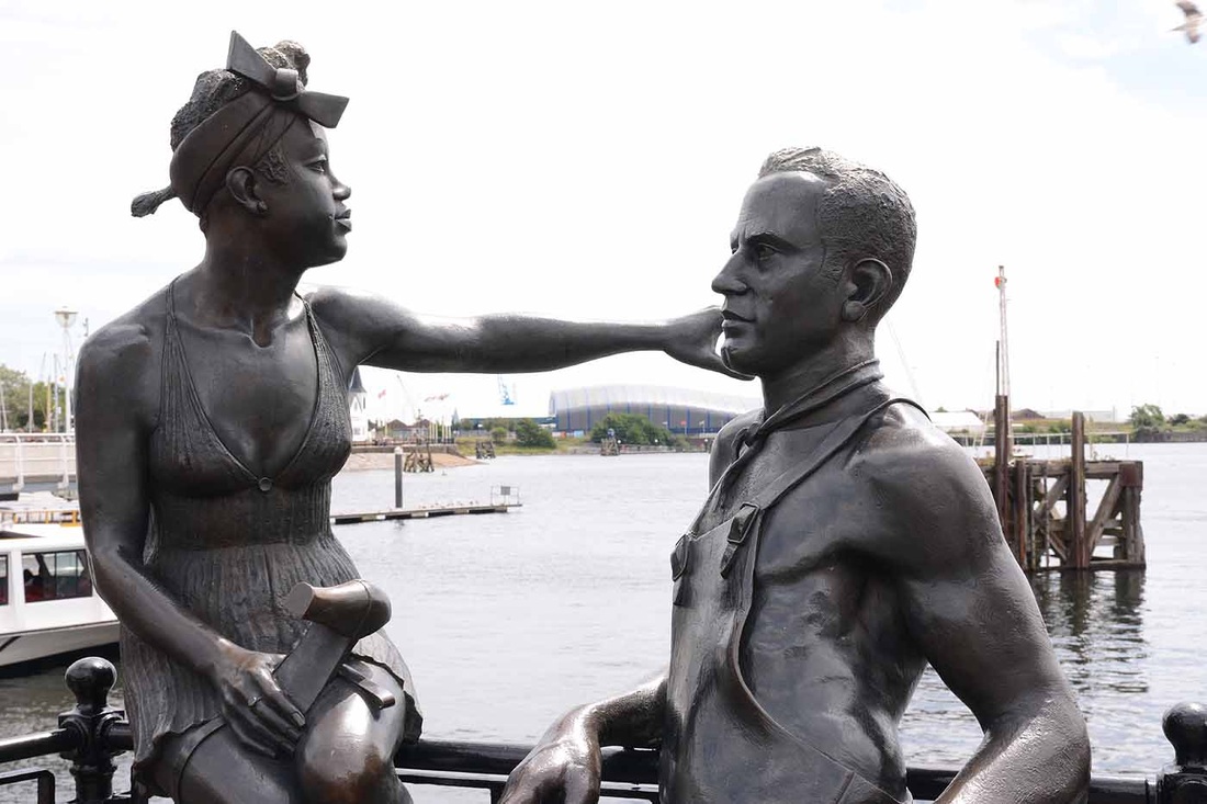
In this last set we are back to statues again with these two figures in the bay. The background is bright and the figures are dark. The camera handles the exposure very well on average but I prefer one of the over exposed images so that there is more detail visible in the detail. The fifth one is f13 @ 1/125. Just for interest, I took an incident light reading on one of the figures with my external Sekonic light meter. This is reproduced below and the exposure the meter recommended and the setting that the image was taken was f11 @ 1/125 - even lighter than the one extra stop exposure at image five as it is one and a half stops over average.


This has been a very interesting two part exercise. Part one has got me thinking more about getting the exposure right 'in-camera' by compensating accordingly for predominantry black or white subjects. Currently, I do not do this enough. I sometimes get the direction of which way to compensate mixed up! Part two has reinforced my previous use of matrix, centre weighted and spot metering for different situations and I shall think more about choosing the most appropriate option to suit the situation in the future. I did a lot of bracketing when I was doing aerial photography and shooting on colour slide film which had little latitude and there were few opportunities (and money) to go back and do an aerial retake! These days I shoot in Raw and tweak in Photoshop. But the exercise has emphasised to me not to always except the norm of what the camera is producing on an average setting and to think more about exposure.
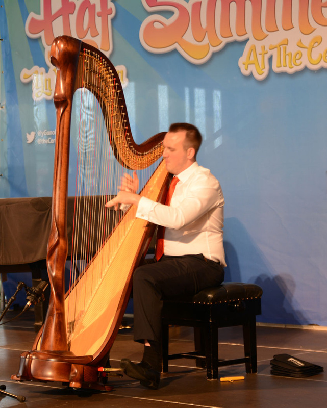
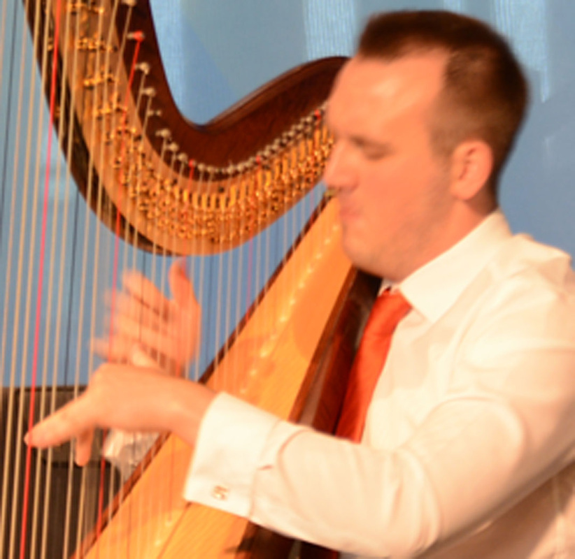
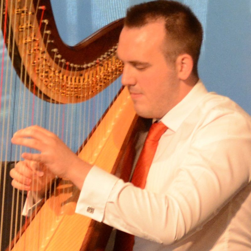
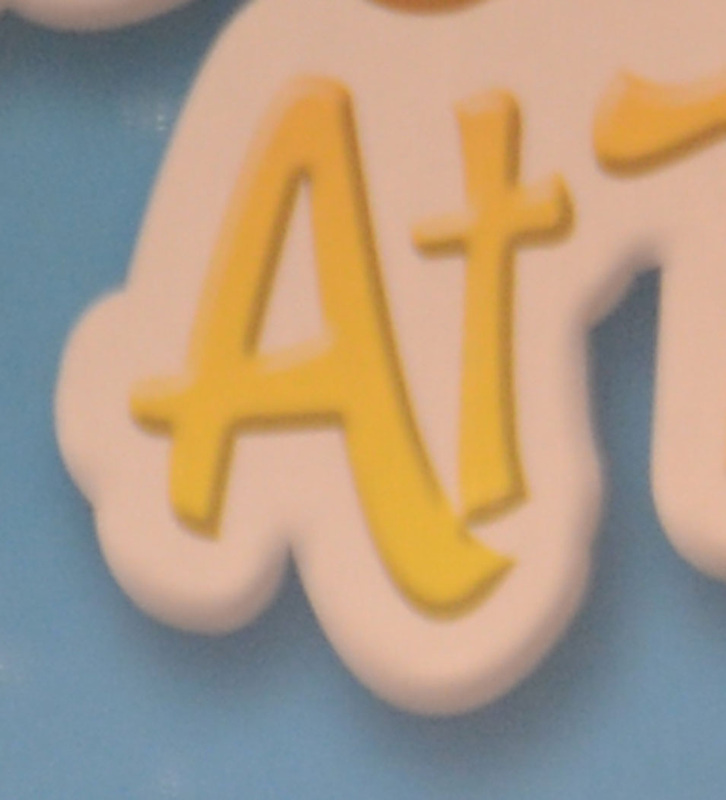
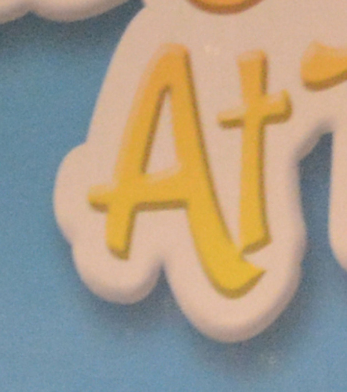
The final exercise in the intensity of light is about higher and lower light sensitivity. We are talking about the third factor that controls exposure after aperture and camera shutter speed - iso setting. We are asked to select a situation which is marginal and where the mixture of light level and subject movement or depth of field is only just possible. We are asked to first shoot at normal sensitivity such as iso 200 then change to a higher sensitivity and to examine the difference. Did the change make it easier and were there photographs that we could not take successfully at the lower sensitivity but that were possible at the higher iso setting? We are asked to look at the difference between the photographs at the two different iso settings. I chose to shoot a Harpist who was playing in the Wales Millennium Centre. The first photograph is below and shows the whole image. The exposure was f2.8 @ 1/20th at iso 200. The camera and lens handled it well. In the second photograph below, when you look at the harpist's hands, which are moving across the strings, they are not sharp because of the 1/20th exposure, plus at 50mm lens setting, there may be some camera shake. So, in the third image below we switch to iso1600 which gave us f4.8 @ 1/90th and the hands are sharp. The Nikon D7100 handles higher iso settings very well so to look at any real degradation of image in terms of noise, we have to compare two very small areas of the photograph. We have chosen the 'At' in the text on the background. In the final two images of the letters 'At' which are highly enlarged, we can see extra noise in the higher iso setting on the last photograph. Noise is more apparent in darker colours and in this image it is showing up in the blue. However, modern cameras such as the Nikon D7100 have fantastic capabilities at higher iso settings and the latest Canon 5D mark 3 is outstanding - so we don't have to worry too much about higher iso settings these days with modern digital high performance cameras, but we need to be aware of how effective management of the iso can contribute to more successful photography.